Since 2009, I’ve been tracking what songs I listen on last.fm using the then popular Winamp and nowadays Spotify. I was always wondering what questions I could answer from this data, such as:
- How does my activity look like throughout the years?
- Which days are the most active?
- How has my music taste evolved over this period?
- I know that I had a lot of obsessions with various songs. Can I identify them? And how long did they last?
- Are there patterns of music genres that I listen to through the year?
Collecting data Link to heading
Fortunately, there are many free tools for getting last.fm data so there was no need to spend time on writing code and learning how their API works. The tool I used was https://lastfm.ghan.nl/export/ and I got back a 145Mb file containing around 200k scrobbles. If an average song is 3 minutes long, this is more than 416 days of listening time!
After cleaning up the file and using the musicbrainz‘s API to get each artists genre information (which took quite a while as I had to limit my requests to 1/sec and there were over 6k unique artists) I was ready to analyse the data using pandas and seaborn. After constructing a dataframe (see below) with all the information I needed (around 42Mb) I was ready to analyse my listening history!
| artist | album | name | data | genres |
|---|---|---|---|---|
| {“mbid”:”cc0b7089-c08d-4c10-b6b0-873582c17fd6″,”#text”:”System of a Down”} | {‘mbid’: ’03bfb2be-bb2e-3252-ae04-ed15e2c333c6′, ‘#text’: ‘Toxicity’} | Chop Suey! | 2021-11-20 14:57:45 | [rock, nu metal, metal, experimental rock] |
| {“mbid”:”f59c5520-5f46-4d2c-b2c4-822eabf53419″,”#text”:”Linkin Park”} | {‘mbid’: ”, ‘#text’: ‘Hybrid Theory (Bonus Edition)’} | Papercut | 2021-11-20 14:51:48 | [rock, rapcore, rap rock, rap metal, pop rock] |
| … | … | … | … | … |
Yearly activity Link to heading
The best way to visualise this is by creating a heatmap per year. This was a good start to familiarize myself with pandas and seaborn and I was able to do it with the code snippet below. First, I grouped my data per year, added a new day column and finally use the heatmap function of the seaborn library.
def generate_yearly_play_heatmaps(df):
    start_year = df.iloc[-1]['date'].year
    end_year = df.iloc[0]['date'].year

    for year in range(start_year, end_year + 1):
        begin = datetime.datetime(year, 1, 1)
        end = datetime.datetime(year, 12, 31)
        days = pd.DataFrame({'plays':0,
                             'date':pd.date_range(begin, end, freq='D')})
        month_names = pd.date_range(begin, end, freq='M').strftime("%B").tolist()

        # Get yearly data
        yearly_data = df[(df['date'] > begin) & (df['date'] < end)]
        yearly_data = pd.merge(yearly_data, days, how='outer', left_on='date', right_on='date')
        yearly_data['date'] = pd.to_datetime(yearly_data['date']).dt.normalize()
        yearly_data = yearly_data.value_counts(['date']).reset_index(name="plays")

        # Since we injected some new data, replace them with 0
        yearly_data.loc[yearly_data['plays'] == 1, 'plays'] = 0

        # Generate extra day/month columns
        yearly_data = yearly_data.sort_values('date')
        yearly_data['month'] = yearly_data['date'].dt.month_name()
        yearly_data['date'] = yearly_data['date'].dt.strftime('%d')

        # Create monthly dfs for easier plotting
        month = yearly_data.reset_index().pivot(index='month', columns='date', values='plays').reindex(month_names)
        fig, ax = plt.subplots(figsize=(31,12))
        sns.heatmap(month, ax=ax, cmap=sns.color_palette("crest", as_cmap=True), annot=True, fmt='g', square=True)
        plt.title('Number of songs listened each day in ' + str(year))
        plt.xlabel('Day')
        plt.ylabel('Month')
        fig.savefig('heatmaps/plays_in_' + str(year) + '.png')
After running it, I was pleased to get some nice heatmaps:
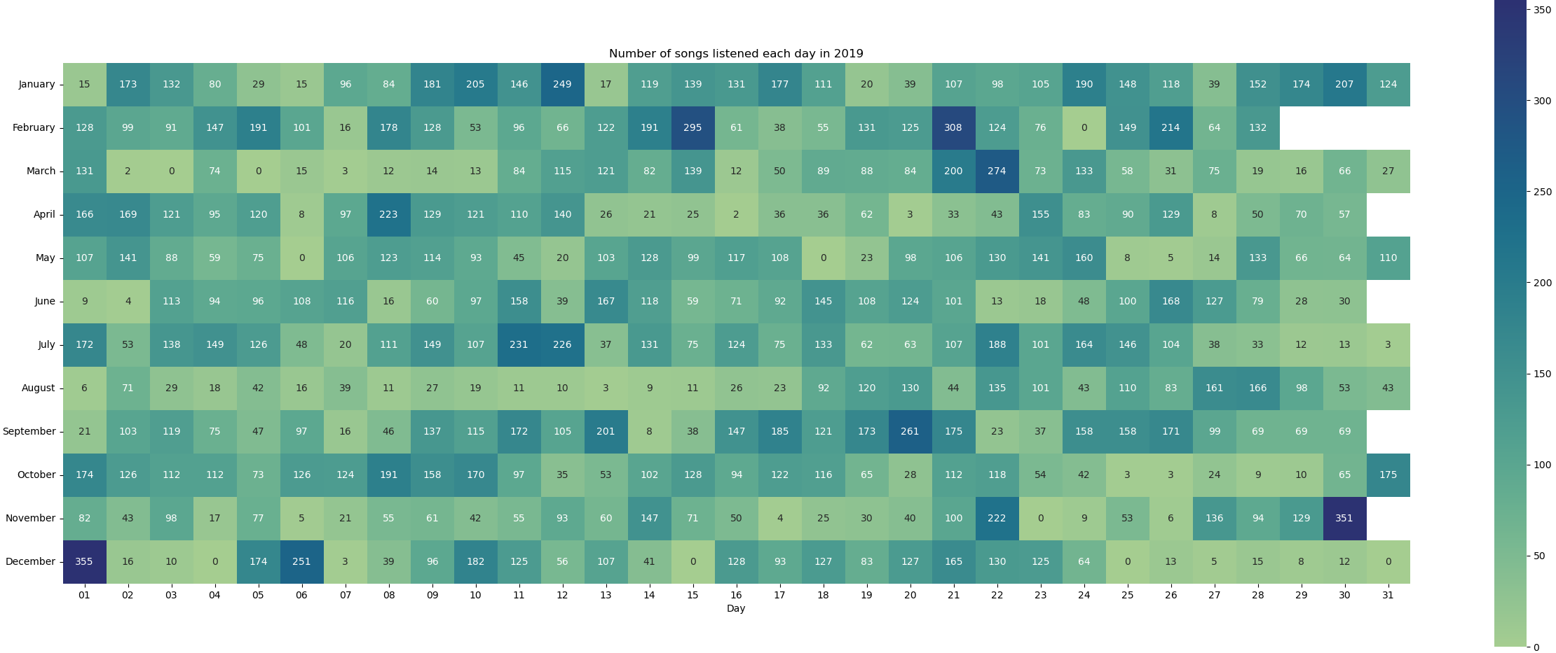
Now that I got the hang of it, I was ready to tackle some more interesting questions!
Which days are the most active Link to heading
This time, it makes sense to breakdown the analysis not only per year but also per month as some interesting patterns could be observed. The code used can be seen below:
def generate_daily_activity(df):
    start_year = df.iloc[-1]['date'].year
    end_year = df.iloc[0]['date'].year
    day_names = pd.date_range(datetime.datetime(2009, 1, 5), datetime.datetime(2009, 1, 12), freq='D').strftime("%A").tolist()
    month_names = pd.date_range(datetime.datetime(2009, 1, 5), datetime.datetime(2009, 12, 31), freq='M').strftime("%B").tolist()

    yearly_data = df
    yearly_data['day'] = yearly_data['date'].dt.day_name()
    yearly_data['year'] = yearly_data['date'].dt.year
    yearly_data['month'] = yearly_data['date'].dt.month_name()
    monthly_data = yearly_data

    yearly_data = yearly_data.groupby(['day', 'year'], as_index=False).count()
    yd = pd.DataFrame()
    for year in range(start_year + 1, end_year + 1):
        yd = pd.concat([yd, yearly_data.loc[yearly_data['year'] == year].set_index('day').reindex(day_names).reset_index()])

    plt.figure(figsize=(30,30))
    sns.catplot(data=yd, x='year', hue='day', y='date', kind='bar', height=5, aspect=1.7)
    plt.xlabel('Year')
    plt.ylabel('Number of songs listened per day')
    plt.savefig('barplots/daily_plays.png')

    # Get monthly data
    monthly_data = monthly_data.groupby(['month', 'year'], as_index=False).count()
    yd = pd.DataFrame()
    for year in range(start_year + 1, end_year + 1):
        yd = pd.concat([yd, monthly_data.loc[monthly_data['year'] == year].set_index('month').reindex(month_names).reset_index()])

    plt.figure(figsize=(30,30))
    sns.catplot(data=yd, x='month', hue='year', y='date', kind='bar', height=7, aspect=2.7)
    plt.xlabel('Year')
    plt.ylabel('Number of songs listened per month')
    plt.savefig('barplots/monthly_plays.png')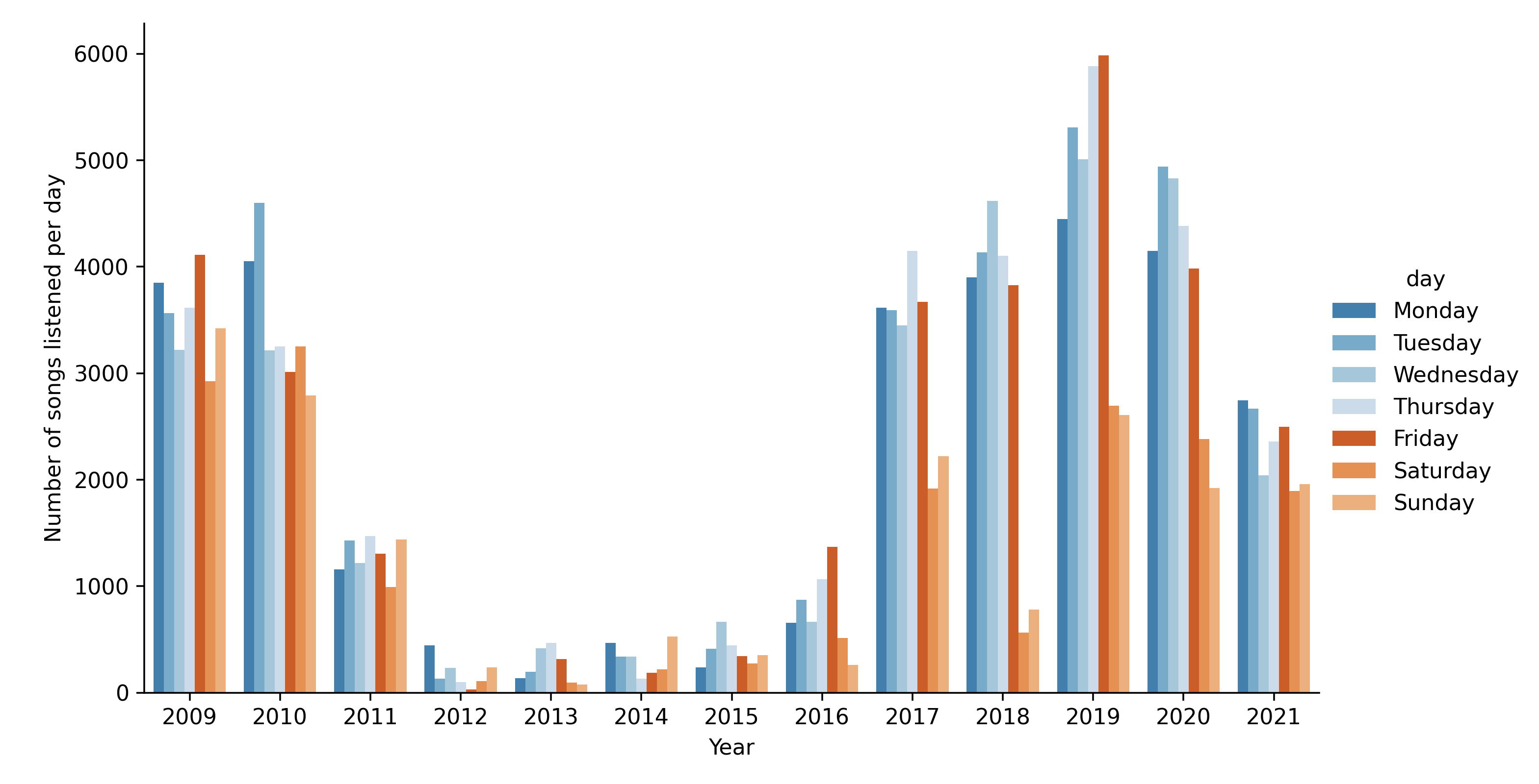
A few key things that I noticed from those graphs are:
- During the period 2009 to 2011 my listening patterns during the week were about the same
- There was a big drop during 2012 to 2016
- In 2017, 2018 and 2019 there is a clear difference between Weekdays and Saturday/Sunday
- 2020 and 2021 this difference has shrinked
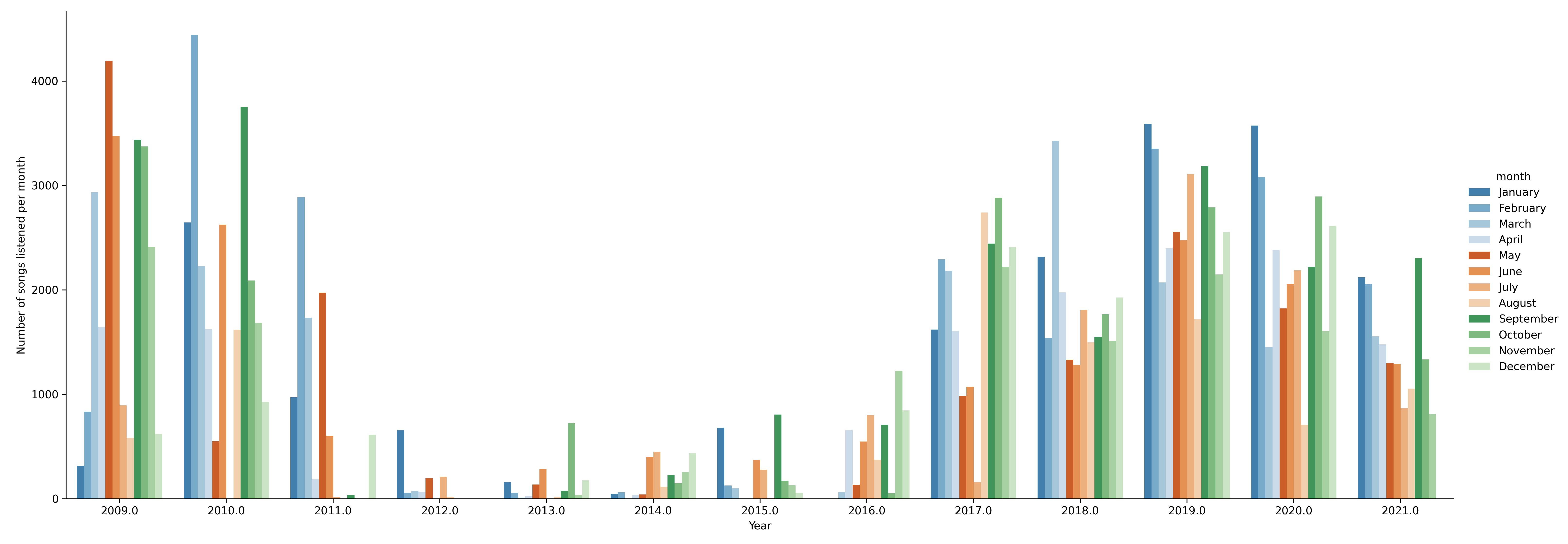
All the above patterns can be explained quite easily: During 2009-2011 I was in the University and from 2012 to 2016 I was mostly listening to radio (no data tracking) that’s why there is a huge drop in the data tracked. In 2016, I started working thus, I was mostly listening to music during work hours (hence the drop on the weekends) and of course early 2020 there was Covid-19 so, the distinction between days became almost non-existent!
So far, everything looks as expected but what I wanted to find out was more meaningful patterns: if and how my music taste changed over the years.
The evolution of my music taste Link to heading
The way I chose to approach this question was simple: Find the top 5 music genres and see how this trend evolves. Each artist has multiple genres thus, I only pick the first one that I got back from musicbrainz in order to keep things simple.
def music_taste(df):
    start_year = df.iloc[-1]['date'].year
    end_year = df.iloc[0]['date'].year

    yearly_data = df
    yearly_data['genres'] = yearly_data['genres'].apply(lambda d: d if isinstance(d, list) else [])
    yearly_data['year'] = yearly_data['date'].dt.year

    yd = pd.DataFrame()
    for year in range(start_year + 1, end_year + 1):
        # Get 5 most popular genres
        tmp_df = pd.DataFrame(yearly_data.loc[yearly_data['year'] == year]['genres'].apply(pd.Series).iloc[:,0].value_counts(normalize = True).rename('norm'))
        tmp_df['year'] = year
        tmp_df['norm'] = tmp_df['norm'].apply(lambda x : x * 100)
        yd = pd.concat([yd, tmp_df[:5]])

    yd.reset_index(inplace=True)

    sns.set()
    sns.set_palette('tab20c')
    pivot_df = yd.pivot(index='year', columns='index', values='norm').sort_index(ascending=False)

    ax = pivot_df.plot.barh(stacked=True, figsize=(30,15))
    handles, labels = ax.get_legend_handles_labels()
    counter = 0
    for i, p in enumerate(ax.patches, 0):
        if (i % len(pivot_df) == 0) & (i != 0):
            counter += 1
        left, bottom, width, height = p.get_bbox().bounds
        label = labels[counter]
        if width > 0:
            ax.annotate((f'{label}: {"%.1f" % width }%'), xy=(left+width/2, bottom+height/2), ha='center', va='center')
    plt.legend(loc='center left', bbox_to_anchor=(1.0, 0.5))
    plt.xlabel('Percentage of listening history')
    plt.title('Top 5 music genres per year')
    plt.savefig('barplots/yearly_genres.png', dpi=320)
After running the above code, I got some interesting results! Looking at the genre trends someone can easily spot a major constant throughout the years (rock) which eventually took a huge portion of my listening time.
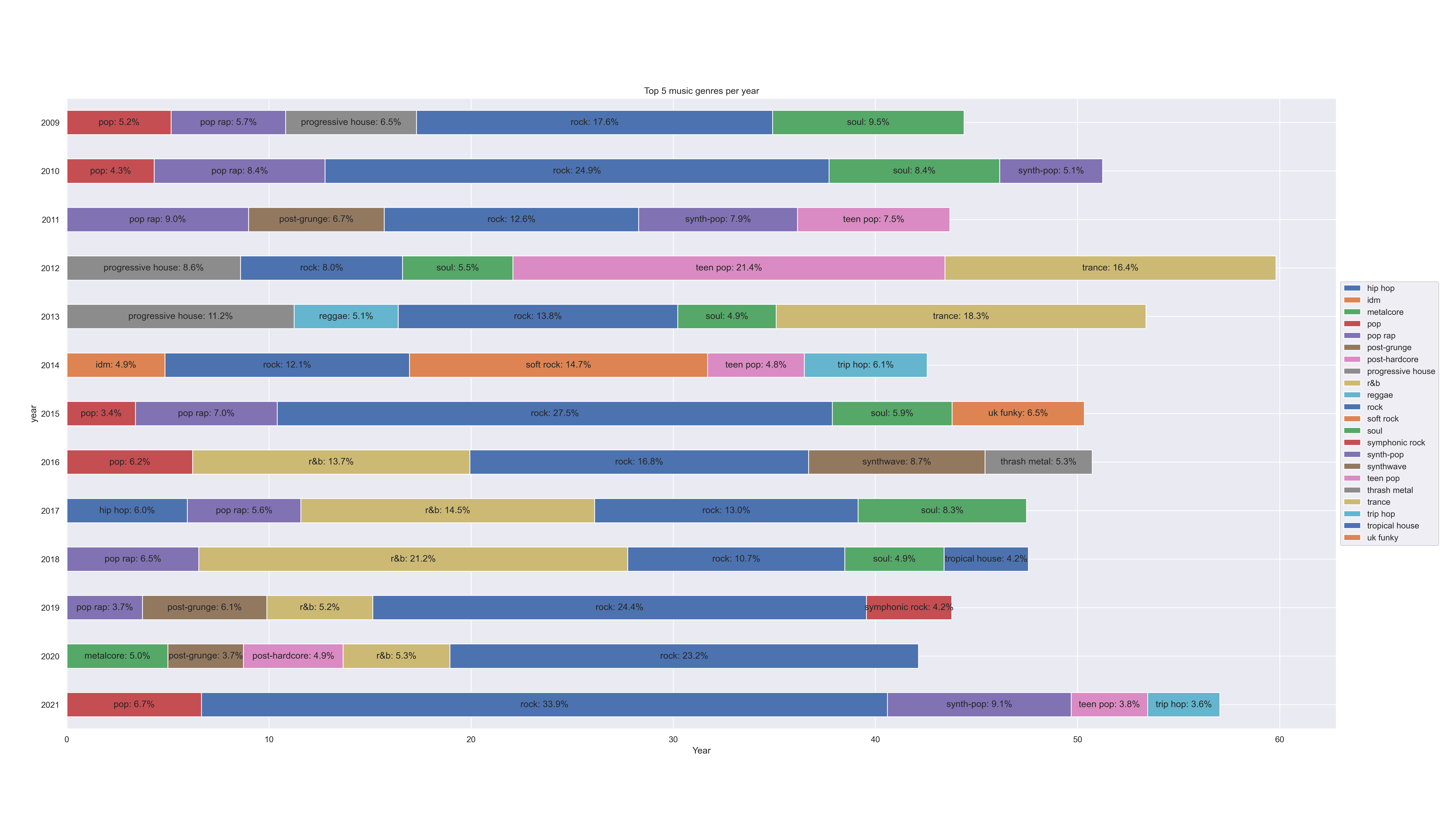
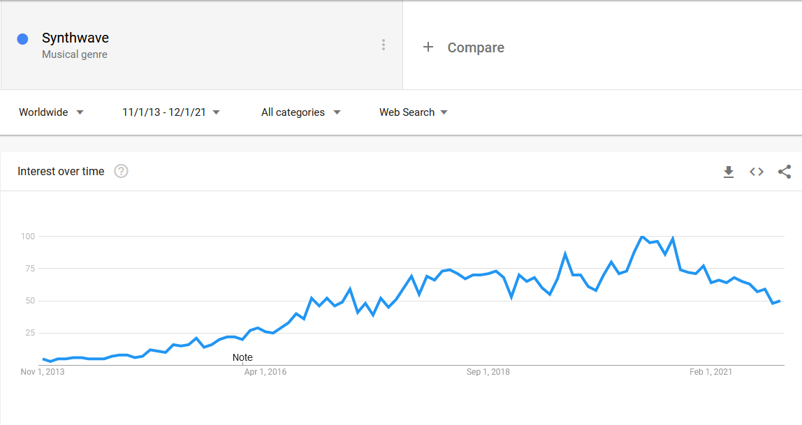
Another thing that I noticed was that as the years go by I started listening to EDM less and new genres slowly took place such as synthwave, synthpop and more heavy rock styles. It’s interesting to focus on synthwave as it was a genre that came out of nowhere and took a large portion of my listening time. The Google trend of this genre shows that it started gaining in popularity around mid 2016 which is exactly when I started listening.
Also, some trends emerged and grew over time, such as r&b but eventually disappeared into oblivion! After my music taste analysis was done it was time to move into something more complicated.
Music obsessions Link to heading
Before measuring this, I had to define what a music obsession is. There are many times where I find myself listening to a song on repeat for days. But how many days before it’s categorized as an obsession? I couldn’t find enough data online, so I came up with this arbitrary rule: “Listening a song for longer than 5 days and at least 5 times per day classifies for an obsession”. So, my next step was to dig into my data and find all the possible songs that fit in the above rule.
def music_obsessions(df):
    # Drop irrelevant columns
    obsessions = df.drop(['genres', 'album', 'artist'], 1)
    obsessions['date'] = df['date'].dt.date

    # Do an early filtering
    # Keep songs that appear more than OBSESSIONS_PLAYS_STREAK * OBSESSIONS_DAYS_STREAK times overall
    obsessions = obsessions[obsessions.groupby(['name'])['name'].transform('size') > (OBSESSIONS_PLAYS_STREAK * OBSESSIONS_DAYS_STREAK)].reset_index(drop=True)

    # Keep songs that appear more than OBSESSIONS_PLAYS_STREAK times per day
    obsessions = obsessions.groupby(['date', 'name']).size().to_frame('size')
    obsessions = obsessions[obsessions['size'] > OBSESSIONS_PLAYS_STREAK].reset_index()

    # Get unique songs
    unique_songs = obsessions['name'].unique()

    # Create final df
    day = pd.Timedelta('1d')
    final_df = pd.DataFrame()
    for song in unique_songs:
        tmp_df = obsessions[obsessions['name'] == song]['date']
        if tmp_df.shape[0] < OBSESSIONS_DAYS_STREAK:
            continue

        # Find consecutive dates
        cons_dates = ((tmp_df - tmp_df.shift(-1)).abs() == day) | (tmp_df.diff() == day)

        # Group consecutive dates and filter based on concurent days
        filtered = tmp_df[cons_dates]
        breaks = filtered.diff() != day
        groups = breaks.cumsum()
        for _, g in filtered.groupby(groups):
            if(g.shape[0] >= OBSESSIONS_DAYS_STREAK):
                days = int((g.iloc[-1] - g.iloc[0]) / day) + 1
                a_df = pd.DataFrame([[song, g.iloc[0], g.iloc[-1], '%.20s (%dd)' % (song , days)]], columns=['Task', 'Start', 'Finish', 'Labels'])
                final_df = pd.concat([final_df, a_df])

    final_df.reset_index(drop=True, inplace=True)

    # Generate gantt chart
    fig = px.timeline(final_df, x_start="Start", x_end="Finish", y="Task", color="Task", text = "Labels")
    fig.update_traces(showlegend=False)
    fig.update_yaxes(autorange="reversed", visible=False)
    fig.write_image("barplots/music_obsessions.png", width=10*300, height=2*300)
I decided that a Gantt chart would be the best way to visualise this and running the above code results in the timeline below. Most of my music obsessions last for 5 days with only 2 exceptions.

Someone might have a different definition of what an obsession is so you can play around with OBSESSIONS_DAYS_STREAK and OBSESSIONS_PLAYS_STREAK and generate the timeline that suits you.
Now that I’ve found my obsessions, I could finally move to the last question which I find to be the most interesting one.
Patterns of music Link to heading
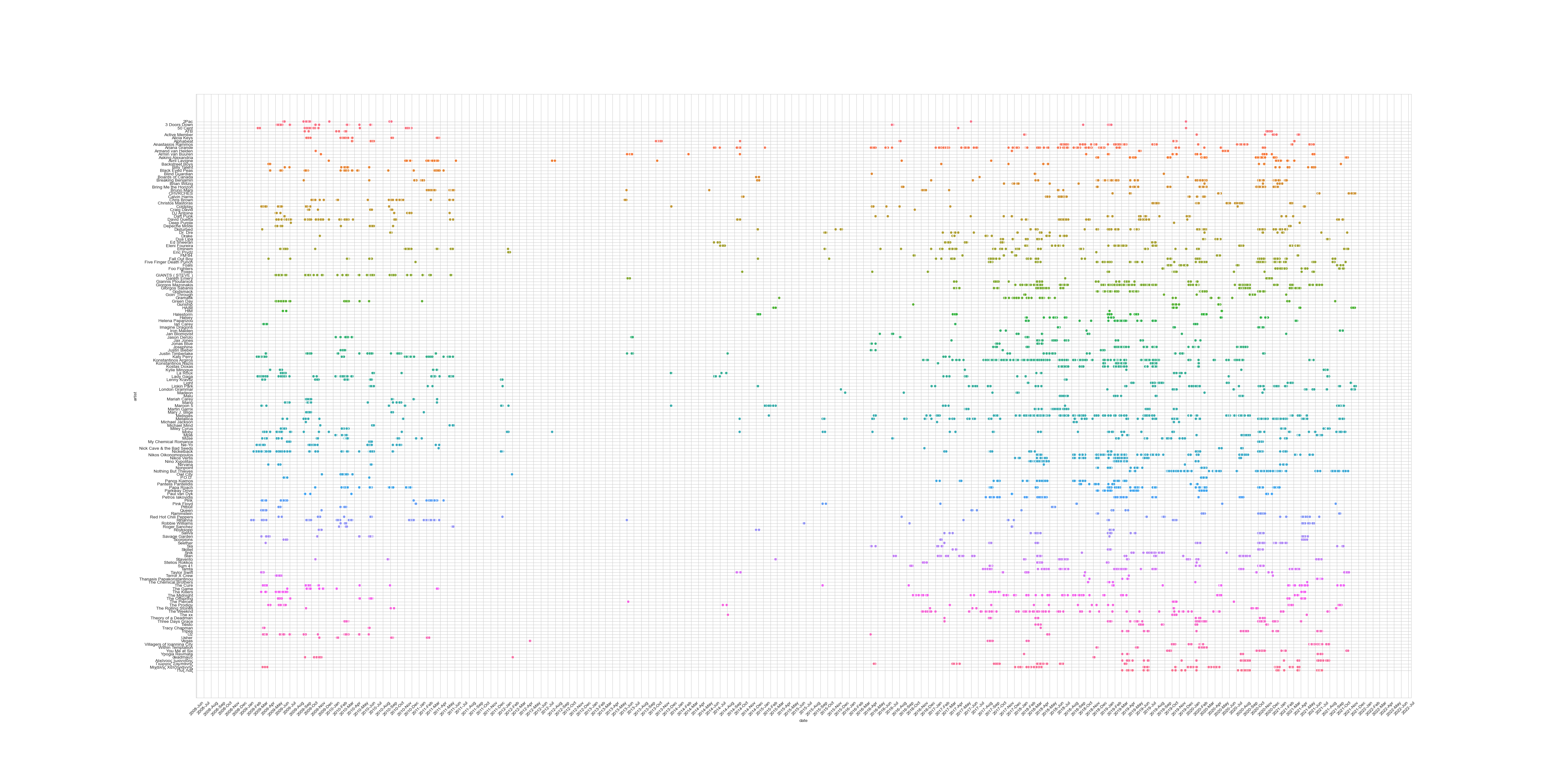
When I started this analysis there was one question that I was aiming to answer: What are my music patterns throughout the years and if there is any consistency? Initially, I thought on doing this analysis on music genres but I decided that it would be more interesting to do this with the actual artists. I would first have to split my data into years and months and then remove the artists that I’ve listened to 1 or 2 times as those were probably into a random playlist. Then, I would have to find which artists keep appearing throughout the years/months and if there is a pattern. For a pattern to occur, I kept only artists that appear more than 3 times through the years, have with more than 10 plays per month and span across 3 or more years.
def music_patterns(df):
    start_year = df.iloc[-1]['date'].year
    end_year = df.iloc[0]['date'].year

    yearly_data = df.drop(['genres', 'album', 'name'], 1)
    yearly_data['artist'] = yearly_data['artist'].apply(lambda d: d['#text'] if isinstance(d, dict) else dict())
    yearly_data['year'] = yearly_data['date'].dt.year
    yearly_data['month'] = yearly_data['date'].dt.month
    yearly_data = yearly_data.dropna()

    yd = pd.DataFrame()
    for year in range(start_year + 1, end_year + 1):
        tmp_df = yearly_data[yearly_data['year'] == year]
        tmp_df['count'] = tmp_df.groupby(['month', 'artist'])['artist'].transform('count')
        tmp_df = tmp_df.drop_duplicates()
        tmp_df['year'] = year
        yd = pd.concat([yd, tmp_df])

    # Drop artists with less than 10 plays per month
    yd = yd[yd['count'] >= 10]
    yd.reset_index(inplace=True, drop=True)

    # Drop artists that appear less than 3 times. (A pattern should be more than 3)
    yd = yd[yd.groupby(['artist'])['artist'].transform('size') > 3]

    # Also drop artists that don't appear in more than 3 different years
    tmp_df = yd.groupby(['artist'], as_index= False)['year'].nunique()
    tmp_df = tmp_df[tmp_df['year'] < 3]
    for artist in tmp_df['artist']:
        yd = yd[~(yd['artist'] == artist)]

    sns.set_style("whitegrid")
    plt.figure(figsize=(60,25))
    ax = sns.scatterplot(x='date', y='artist', hue='artist', legend=False, data=yd)
    # yd.plot(x='date', y='artist', kind='scatter')
    ax.xaxis.set_major_locator(mdates.MonthLocator(interval=1))
    ax.xaxis.set_major_formatter(mdates.DateFormatter('%Y-%B'))
    plt.xticks(rotation=45)
    plt.savefig('barplots/music_patterns.png', dpi=320)
The plot genreated is a bit messy since it contains more than 100 artists but with a closer look (you can click on the image to enlarge it) one can see some interesting patterns. One example is that I tend to listen to Eminem during the period of September – November.
There are many more interesting questions that could be answered but I decided to stop my analysis here as this could take on for weeks! Overall it was a fun project were I learned a bit about pandas, plotting with python and my music taste!